Brand Style Guide
Your logo is often the first impression of your brand. It communicates identity, values, and personality at a glance.
This page will guide you through the key elements of logo design so you can make confident choices. At the end, please complete the Branding Intake Form to share your preferences.
Choosing the Right Logo Type
Your logo visually communicates your brand’s identity, values, and personality at a glance. It’s often the first impression customers have, and it plays a key role in recognition, trust, and differentiation from competitors.
Wordmark
Uses stylized text to represent a brand's name. It typically incorporates customized typography, such as color, shape, and size, to create a distinctive visual representation of the brand name.
Best Practices:
-
Your brand name is memorable – Whether short or longer, a wordmark keeps the focus on the name itself.
-
Your goal is name recognition – A wordmark directly builds familiarity with your brand’s name.
-
Professional, modern look – Wordmarks convey clarity and confidence without extra visual clutter.
Symbol
A symbol logo is a graphic element, either abstract or pictorial, used to represent a company or brand. It's a visual representation of a brand, often used alongside or instead of the company's name. These symbols can be easily recognizable and serve as a shorthand for the brand, conveying its values and identity.
Best Practices:
-
You need extreme scalability – Symbols stay clear and recognizable at tiny sizes (app icons, favicons, product stamps)
-
You want to build instant recognition without words – A strong icon can communicate your brand at a glance.
-
You’re building a lifestyle brand – People are more likely to wear or display a symbol than a wordmark (great for fashion, sports, tech)
Lettermark
Uses stylized text to represent a brand's name. It typically incorporates customized typography, such as color, shape, and size, to create a distinctive visual representation of the brand name.
Best Practices:
-
Your brand name is long or complex – Initials simplify lengthy names into something easier to recognize.
-
You need versatility – Works well across digital and print without losing legibility at small sizes.
-
You want a timeless, professional look – Initial-based marks feel established and authoritative.
Combination Mark
A combination mark logo includes both text and a symbol or icon. This blend allows for flexibility in branding, as the elements can be used together or separately while maintaining brand recognition.
Best Practices:
-
You want flexibility – Text + symbol can be used together or separately depending on context.
-
Your name alone isn’t enough (yet) – Pairing with an icon helps people remember you faster.
-
Scalability in mixed media – Use the full version on larger formats and just the symbol on smaller ones
Choosing the Right Font
The typeface sets the tone of your brand, whether modern, classic, playful, or professional. It instantly shapes how people perceive your business.
Serif Fonts
Serif fonts have small decorative strokes at the ends of letters, giving them a timeless and professional feel. In logos, they convey tradition, credibility, and sophistication.
Script & Handwritten Fonts
Script and handwritten fonts have flowing, personalized shapes that feel expressive and human. In logos, they add warmth, creativity, or elegance.
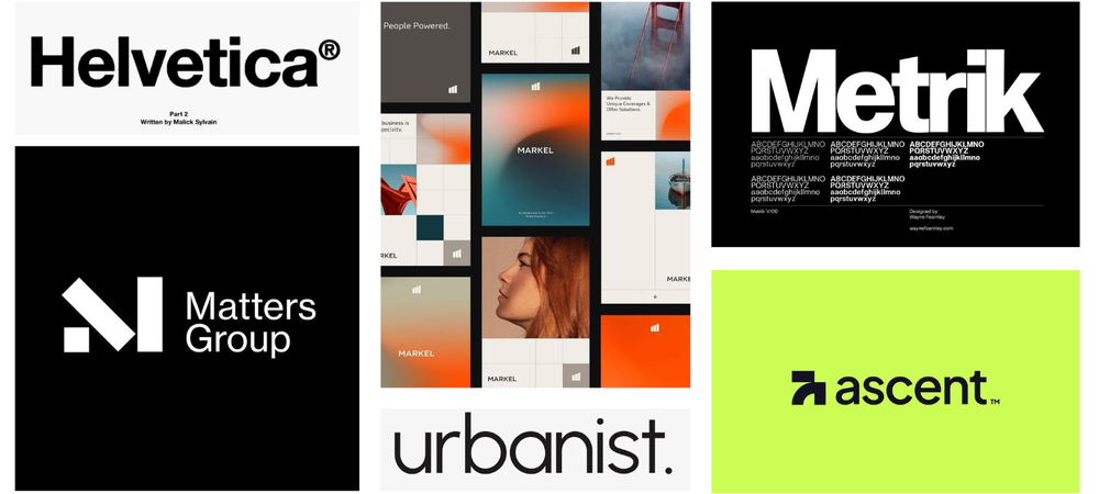
Sans Serif Fonts
Sans serif fonts are clean and modern, without extra strokes, creating a simple and approachable look. They work well in logos for friendly, minimalist, or tech-focused brands.
Display Fonts
Display fonts are bold, unique, and attention-grabbing, designed to make an impact. They’re perfect for brands that have a strong personality.
Choosing the Right Colors
Colors affect how people feel and see your brand. The right choices can attract your audience, show your brand’s personality, and make it more memorable. Using colors consistently builds identity and helps you stand out.
Red
When to Use Red in a Logo:
-
You want to project energy, passion, urgency, or excitement
-
You want immediate attention in a crowded market
-
Your audience resonates with strong, emotional visuals
When Not to Use Red in a Logo
-
Your brand identity leans toward calm, trust, or relaxation
-
Your audience may find bold visuals overwhelming or aggressive
Orange
When to Use Orange in a Logo:
-
You want to convey warmth, friendliness, and approachability
-
Your brand is playful, energetic, or creative
-
Your brand thrives on innovation, optimism, or adventure
When Not to Use Orange in a Logo
-
You need to project seriousness, professionalism, or luxury
-
Your audience expects calm, trust, or authority
-
Your palette already has many bold tones - orange can clash or overwhelm easily
Yellow
When to Use Yellow in a Logo
-
Your brand projects optimism, positivity, and happiness
-
You want to grab attention without the intensity of red or orange
-
You want to feel approachable, cheerful, and fun
When Not to Use Yellow in a Logo
-
You need to project authority, professionalism, or seriousness
-
You want a luxury or high-end feel (yellow can come off as casual rather than refined)
-
Your design relies heavily on legibility - yellow can be hard to read on light backgrounds
Green
When to Use Green in a Logo
-
You want to emphasize growth, renewal, or balance
-
Your brand is connected to nature, sustainability, or wellness
-
Your brand values harmony, calm, and grounded energy
When Not to Use Green in a Logo
-
Your brand thrives on urgency, excitement, or bold energy (green is more calming than fiery)
-
You want to project luxury, glamour, or exclusivity (green usually feels approachable rather than elite)
-
Your industry doesn’t align with nature, health, or finance (green may confuse your audience)
Blue
When to Use Blue in a Logo
-
You want to convey trust, reliability, and professionalism
-
You want a calm, clean, and confident tone, rather than bold or flashy
-
Your audience values security, expertise, or thoughtful innovation
When Not to Use Blue in a Logo
-
You want to project excitement, urgency, or high energy (blue is steady, not fierce)
-
You want to stand out in industries already saturated with blue logos (like banks and tech companies)
Purple
When to Use Purple in a Logo
-
You want to convey luxury, sophistication, or creativity
-
You want to evoke imagination, spirituality, or a sense of mystery
-
You want a color that feels both rich and distinctive
When Not to Use Purple in a Logo
-
You want to project approachability, friendliness, or casual energy (purple can feel formal)
-
Your brand needs to feel bold and energetic rather than elegant
-
Your palette already includes strong primary colors (purple can clash or overwhelm if not balanced)
Pink
When to Use Pink in a Logo
-
You want to convey playfulness, warmth, or femininity
-
Your audience appreciates fun, approachable, and trendy aesthetics
-
You want a bold, youthful, or cheerful tone without feeling aggressive
When Not to Use Pink in a Logo
-
You want to project seriousness, professionalism, or authority
-
Your audience may perceive pink as overly gendered or limiting
-
You want a timeless or neutral look (pink can feel trend-driven)
Brown / Tan
When to Use Brown/Tan in a Logo
-
You want to convey warmth, reliability, stability, or honesty
-
Your audience appreciates earthy, natural, or rustic aesthetics
-
You want a down-to-earth, classic, or timeless feel
When Not to Use Brown/Tan in a Logo
-
You want a bold or energetic look
-
You want to project luxury that is sleek rather than rustic
-
Your design relies on high contrast or bright, attention-grabbing visuals
Black
When to Use Black in a Logo
-
You want to convey sophistication, elegance, or luxury
-
Your brand aims for a timeless, classic, or high-end aesthetic
-
Your audience values professionalism, confidence, and simplicity
When Not to Use Black in a Logo
-
You want to feel approachable, playful, or friendly (black can feel formal or intimidating)
-
Your brand identity emphasizes warmth, softness, or lightheartedness
-
You’re targeting children, casual lifestyle markets, or playful industries
Gray
When to Use Gray in a Logo
-
You want to convey neutrality, balance, and sophistication
-
Your brand aims for a modern, minimalist, or professional aesthetic
-
Your audience values reliability, calm, and timeless design
-
You need a versatile color that won’t overwhelm or dominate your palette
When Not to Use Gray in a Logo
-
You want to feel energetic, vibrant, or playful (gray can feel muted or dull)
-
Your brand needs boldness, attention-grabbing impact, or emotional warmth
White
When to Use White in a Logo
-
You want to convey simplicity, cleanliness, and minimalism
-
Your brand aims for a modern, elegant, or timeless aesthetic
-
You want a light, open, and airy feel
When Not to Use White in a Logo
-
Your brand identity relies on warmth, energy, or vibrancy
-
Your audience may perceive minimalism as cold or impersonal in certain contexts
Need Help Deciding?
Explore the example styles below and see which style feels most aligned with your vision.
Corporate style branding refers to a visual and strategic identity that conveys professionalism, credibility, and
reliability.
Fonts
Corporate style often uses clean, professional fonts that convey trust and clarity. Sans-serif fonts are ideal for a modern and versatile feel, while Serif fonts are ideal for a more traditional or authoritative feel.
Colors
Corporate palettes are often muted, classic, or bold in a controlled way.

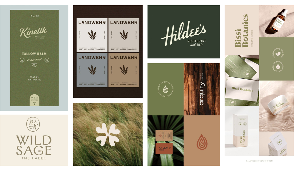
Organic style branding emphasizes natural, authentic, and approachable qualities. It’s a visual approach to
feel human, warm, and connected to nature or sustainability.
Fonts
Organic styles often lean into serif or handwritten display fonts that feel approachable and human. Fonts that look a little hand-drawn or not too perfect make a brand feel more real and handmade, while serif fonts with soft curves give it a classic and natural look.
Colors
Organic palettes are often soft pastels or muted shades. This adds a welcoming touch, keeping the look grounded and authentic.

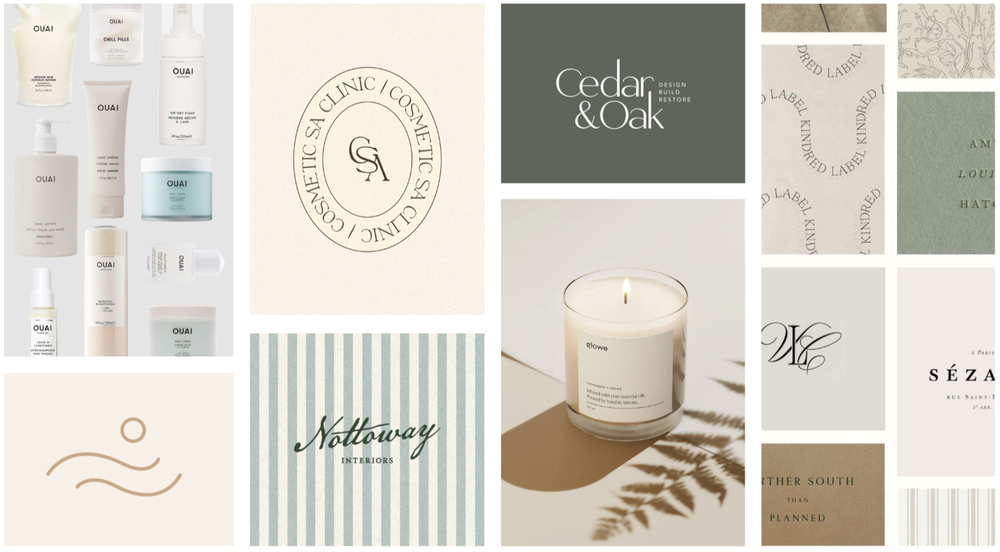
Minimalism style branding emphasizes simplicity and clarity. The idea is to keep the aesthetic simple, clean, and uncluttered, letting negative space and contrast do the heavy lifting.
Fonts
A minimalist style uses clean, simple, and modern fonts. Sans-serif or simple script typefaces with no unnecessary details work best for their clarity and elegance. The focus is on straightforward typography that feels sleek and timeless, letting the words speak without distraction.
Colors
Minimalist palettes usually stick to neutrals, like black, white, gray, beige, or soft muted shades. Sometimes a single accent color (like a muted blue or a bold red) is added for emphasis.

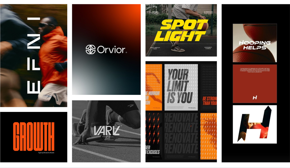
Athletic style branding emphasizes energy and confidence. The overall look is dynamic and motivating, designed to connect with performance, competition, and an active
Fonts
For an athletic brand, bold sans serif fonts or strong, angular display fonts are most effective. These font styles convey strength, energy, speed, and performance - qualities that align with sports and active lifestyles. They are also highly legible and impactful, making them ideal for use on apparel, gear, and digital platforms.
Colors
Athletic color palettes are usually high-contrast and energetic, like bold reds, deep blues, blacks, or vibrant neons. These colors create excitement and intensity while signaling strength and determination.

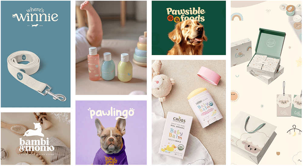
Friendly branding is warm and approachable, creating a sense of trust, comfort, and positivity. It’s especially effective for baby and pet brands, where a caring and inclusive personality matters most.
Fonts
Friendly branding favors rounded sans-serif fonts that feel approachable and modern. The fonts are clear and easy to read, but with soft edges that give warmth and personality.
Colors
Colors are warm, inviting, and balanced, like soft blues, warm yellows, gentle greens, or peach tones. Palettes tend to be cheerful without being overly bold.

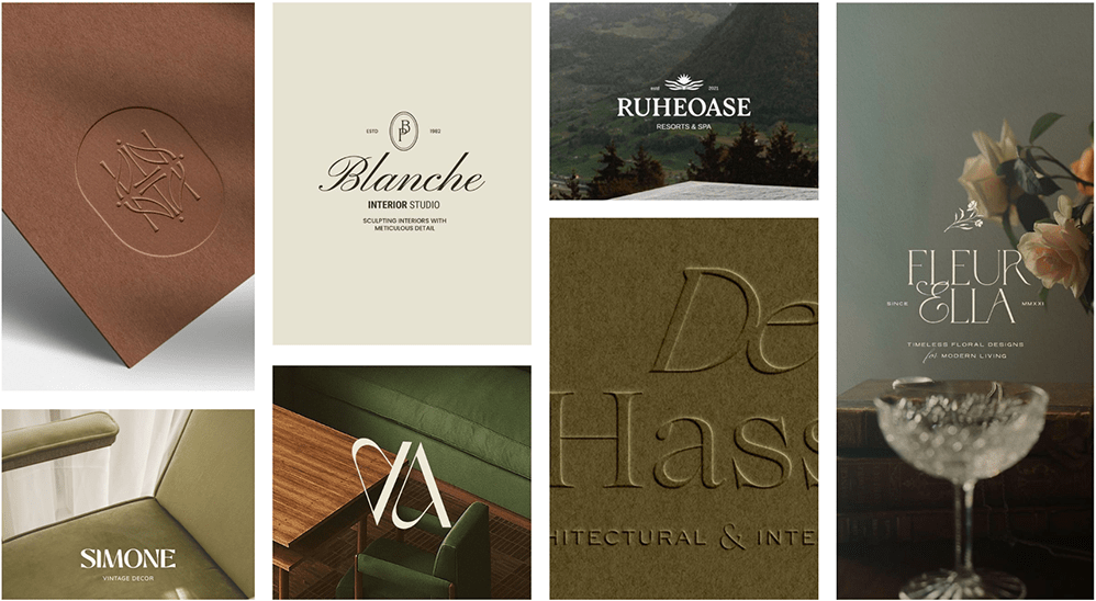
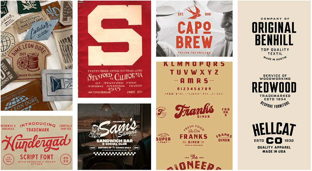
Vintage branding emphasizes a sense of nostalgia and timelessness. It blends classic fonts with warm, muted colors to create a look that feels authentic, familiar, and trustworthy.
Fonts
Vintage branding often leans on classic serif fonts, typewriter styles, or hand-lettered scripts that feel nostalgic and timeless. The typography is meant to feel heritage-driven, familiar, and crafted.
Colors
Vintage palettes are usually muted, warm, and earthy, often inspired by aged prints or retro design. Think deep browns, faded blues, muted reds, mustard yellows, and sepia tones. These colors create a sense of history and comfort, giving the brand an established and enduring feel.

Luxury style branding is refined, elegant, and designed to evoke exclusivity. The style focuses on simplicity with premium details, creating a polished and aspirational feel.
Fonts
Luxury brands often use sleek serif fonts with high contrast (thin and thick strokes) to create a refined and elegant feel or minimalist sans-serif fonts for a more modern, luxury look.
Colors
Luxury color palettes lean on rich, timeless tones such as black, white, gold, silver, deep navy, emerald, or burgundy. The overall palette stays elegant, creating a polished, upscale impression.
